Quantcast
Channel: The Gentleman Stationer
Viewing all 1924 articles
Browse latest View live

Why on Earth Did Sailor Discontinue Apricot?

$
0
0

Ever since we got the word last year that Sailor was discontinuing it's current Jentle line of inks, and, somewhat oddly, replacing them with new versions of inks previously issued as "limited editions", I've been mourning the discontinuation of Apricot, Sailor's orange ink.  I understand that this is utterly nonsensical.  I'm hoarding two or three bottles of the stuff, and since I've only finished one or two bottles of ink in the five years I've been in this hobby, this probably qualifies as a 10-year supply, if not more.  (Some people may use orange ink on a daily basis.  I don't.)  Despite this, over the past year I've been searching for a suitable alternative to my Apricot, should I ever run out.   

If you look carefully, in the background, you can see my newest ink obsession.  

If you look carefully, in the background, you can see my newest ink obsession.  

Enter the first pretender.  Iroshizuku Yu-Yake is a perfectly good ink.  It doesn't feather on my cheap office paper, it flows well, and it has a nice pure orange color that shades decently.  So what's the problem with it?  I'll show you: 

This isn't a 100% accurate color reproduction, but it's close (Orange Inks are hard to photograph/scan.)  In this picture, the Yu-yake shows up a tad light, and the Apricot a shade darker, but the difference in vibrancy is accurate.  

This isn't a 100% accurate color reproduction, but it's close (Orange Inks are hard to photograph/scan.)  In this picture, the Yu-yake shows up a tad light, and the Apricot a shade darker, but the difference in vibrancy is accurate.  

Yu-yake certainly doesn't have the same "pop" as the Apricot, and to be fair, Pilot probably intended Yu-Yake to be a completely different color.  It's also somewhat unfair that I chose to show off the Apricot in a 1911 with a Nagahara-tuned music nib, but Apricot looks just as good in a fine nib.  Iroshizuku does win out on the cheap office paper that I have to use on a daily basis at work, so I will probably keep this bottle around.  Apricot tends to bleed through.

The hunt for a suitable Apricot replacement continues.  But then again, what else do I have to do with my time and money?    


Too Many Pens Inked: This Week's Lineup

$
0
0
My week of insanity.  Thought I would take a quick picture to memorialize it forever. 

My week of insanity.  Thought I would take a quick picture to memorialize it forever. 

So I sat down this morning, preparing for my day, and realized that due to some reviews in progress and new ink purchases, I have WAY too many pens inked, and plan on inking three more soon.  (What, I'm supposed to let three brand new bottles of ink just sit there unused until I actual drain a pen?!)  I might as well give you all a post out of it, even though I personally consider having this many inked-up fountain pens to be insane.  What can I say, I'm working my way through them.  They are: 

  1. Parker Vacumatic Major (3rd Generation), Green Celluloid with Medium Nib, inked with Franklin-Christoph Olde Emerald
  2. Waterman Man 100 Patrician, Coral Red with Fine Nib, inked with Bung Box Sapphire.
  3. Sailor 1911 Large, Black with Silver Trim, Nagahara-modified Music Nib, inked with Sailor Jentle Apricot.
  4. Waterman Hemisphere, Black with Gold Trim, Fine Nib, inked with Sailor Jentle Oku-Yama.
  5. Karas Kustoms Ink, Black with Copper Grip, Medium Nib, inked with Sailor Jentle Grenade. 
  6. Kaweco AC-Sport in Red, Medium Nib, inked with Kaweco Blue cartridge. 
  7. Montblanc 146 with .6mm Binder Stub, inked with my mixture of Sheaffer Skrip Red and Aurora Black
  8. Pilot Vanishing Point in Matte Black with Masuyama Broad Stub, inked with Bung Box Blue Black. 
  9. Pilot Metropolitan, Plain Black with a medium nib, inked with my Skrip/Aurora Red-Black mix. 
  10. Sailor Pro Gear Imperial Black Edition, Fine Nib, Inked with Iroshizuku Yu-Yake

I have bottles of Montblanc Corn Poppy Red, JFK Blue Black, and Edelstein Garnet on the way, so I really, really need to write some of these pens dry.  I have several InCoWriMo responses in progress, so that will help, but seriously people, I feel like I have issues.  

Sunday Reading and Iroshizuku Deals via Amazon

$
0
0

Happy Easter/Passover!  This week was simultaneously productive and frustrating, since I was able to complete multiple handwritten pen and ink reviews yet haven't had the opportunity to get them finalized and up on the blog.  From my updated EDC, however, you should have some idea what I've been working with and what might be on the way.  For now, a few things that caught my attention: 

  1. Pete Denison has an interesting piece on introversion which links to two fascinating articles and delves into office politics.  I for one can relate.  For those of you who are interested in reading further, I would highly recommend Quiet: The Power of Introverts in a World That Can't Stop Talking, by Susan Cain.  (Affiliate Link.)   
  2. Brian from OfficeSupplyGeek reviews J. Herbin Stormy Grey.  Every time I see this ink, I want it, but something about putting "floating particles of gold" into my pens pretty much guarantees that this particular ink will never happen for me.  If I can't use an ink for everyday purposes, and leave it sitting for a while, it's too high maintenance.  (Not that Stormy Grey isn't a cool idea, in and of itself.  Same goes for Rouge Hematite.)  
  3. While I prefer to link to independent pen retailers, Amazon has some sick deals right now on Iroshizuku Ink.  Some bottles are now priced at around $20-$24, with Prime shipping available, and some are sub-$20 with free regular shipping, including the Yu-Yake Ink that I recently reviewed.  Many appear to ship directly from Japan.  I've pulled together a page of what I found to be the best prices/shipping deals onto a page in my Amazon Affiliate Store.  I picked up Shin Kai for $21, Prime eligible.  Here's the deal for Yu-Yake ($18.81 with Free Shipping).  I wonder if Pilot/Namiki is feeling some price competition from Sailor?  UPDATE:  Gary at Notegeist informed me that Ebay Seller Pens 'n More also has some good deals on Iroshizuku, with some bottles going for less than $20 and the "mini" 15ml Iroshizukus going for under $10 each, with free shipping.  

Nagahara Nib: The Review

$
0
0
My Sailor 1911 Large with a Nagahara-tuned music nib, atop my Baron Fig Confidant. 

My Sailor 1911 Large with a Nagahara-tuned music nib, atop my Baron Fig Confidant. 

I've been sitting on this pen review for a while.  Since August, actually, when I picked up this pen at last year's D.C. Pen Show.  And honestly, I still don't know how I feel about it.  It’s slowly growing on me, but I have to confess that I’m still at that point where I love what this object represents more than the object itself.  

Sailor 1911 (left) compared against the Montblanc 146 (right).  Note that the Sailor has one less cap band ring, is slightly shorter, and of course lacks the signature MB "snowcap" on the top of the cap.  

Sailor 1911 (left) compared against the Montblanc 146 (right).  Note that the Sailor has one less cap band ring, is slightly shorter, and of course lacks the signature MB "snowcap" on the top of the cap.  

This pen is a standard Sailor 1911 Large, made of black resin with silver trim.  There is nothing remarkable about this pen’s looks, other than it could serve as a nearly identical replacement for a Montblanc 146.  I don’t mean to imply here that this pen is a “cheap alternative” to a MB, or a knockoff.  First of all, it’s not cheap (around $250 at PenChalet), with certain special editions such as the “Black Lustre” model running over $400.  Second, Sailor has been around for a while, and I consider Sailor pens equal to or superior in quality to Montblanc pens in most respects, especially the nibs.  Of course, for most Sailor models you will have to live without the piston filler, and Sailor converters have a small ink capacity.  For me, that's a positive, because I like to re-ink often.    

IMG_0051.jpg
IMG_0045.jpg

This particular pen is special because of the nib.  As you might have read in pen circles, legendary nibmeister Nobuyoshi Nagahara recently passed away.  Mr. Nagahara, the creator of Sailor’s “Specialty nibs” such as the Naginata Togi and Naginata Emperor, had not traveled or worked nib clinics for several years; his son Yukio took his place representing Sailor abroad, and it was the younger Mr. Nagahara who ground this nib in D.C.  He was adjusting the nib on any Sailor pen for free, and I couldn't leave without an example of his work to take home with me.  

IMG_0049.jpg
IMG_0048.jpg
IMG_0044.jpg


The nib on this pen started out as a standard Sailor music nib.  I have very little experience with music nib pens--this is the only such pen I've ever owned--but the hallmark of a music nib, traditionally, is that the nib has three tines and two slits, ensuring a very heavy flow of ink that would leave a very wet line when scoring music. (Hence the name.)  Sailor's music nib, however, is basically just a stub.  There is no second nib slit or third tine, and I sometimes wonder why they bother to call it a music nib at all. 

What Sailor's music nibs are is wide.  I've realized over the past few years that my ideal nib width is something on the finer side of medium, and I will go broader than that in a specialty nib such as a stub, a cursive italic, or an architect's point. But a .6mm stub is my sweet spot.  Richard Binder ground a .6mm stub onto my medium Montblanc 146, and it remains, to this day, perhaps my favorite nib in my collection.  My thinking was that I could take a standard Sailor music nib and have Mr. Nagahara grind it to my preferred size.  

The thing with this nib is that Nagahara nailed the width of the nib but the grind is very sharp on the cross-stroke.  If you look at the handwritten sample, the nib appears to be more of a true italic than a stub (which is supposed to be rounded at the edges to make it more useful for day-to-day writing).  I’ve been using this nib for six months or so and it has smoothed out some, but it’s still too sharp to use at work.  Between the sharp line on the cross-stroke and the wetness of the down-stroke, it doesn’t handle cheap paper well.  

Despite the limited utility, my handwriting looks awesome with this pen.  And I love the fact that Mr. Nagahara adjusted the nib so that I can write with an XXF point when I flip the nib over.  For that reason alone, I won’t do anything drastic.  But I may have Mike Masuyama smooth it out in Atlanta, just a little.  I'd love to have this be my daily writer.  

Sailor 1911 Ink Review, Nagahara Nib with Yama-Dori. 

Sailor 1911 Ink Review, Nagahara Nib with Yama-Dori. 

Pre-Atlanta Pen Show Weekend Reading!

$
0
0

This week in Pendom: 

  1. Ed Jelley writes about his trip to C.W. Pencil Enterprises.  I have a trip to NYC on the schedule for May.  Can't wait! 
  2. Mary at From the Pen Cup reviews some orange pens, including the Lamy Copper Orange AL-Star that I liked so much.  In case you missed it, my thoughts on this pen here
  3. I really, really, really miss living in Europe.  This store looks absolutely incredible.  Then again, it's probably a good thing.  (Via Gourmetpens) 
  4. Doug over at Modern Stationer reviews the Lamy 2000, one of my favorites.  
  5. Did I tell you how much I miss living in Europe?  Hope you enjoyed your vacation, Ian!
  6. Check out the latest episode of Dot Grid Podcast.  This week, Will talks with Mike Rohde of Sketchnote fame.  I wish I could make the presentation he is giving here a the Skillery in Nashville, but, well, life.... 
  7. Mark at WriteAnalog is giving away a Field Notes bundle this week.  Sign up for his great newsletter to enter! 

A couple updates on the blog: I've added a Review Index.  Honestly, I'm not crazy about the current design but I'm going on a year and I felt that I needed to do something to make the content more manageable.  

I've also added a link to my Amazon affiliate store.  I typically like to promote deals from independent retailers, but occasionally Amazon will offer a good deal, or I'll link to books, etc., that aren't available anywhere else.  It's nice to have a place to park these links.  I truly appreciate all of you who have bought stuff via my affiliate links and helped me support this my little side project. 

Finally, I'm off to the Atlanta Pen Show this week!  I may be a bit sparse as I try to get everything squared away at work, but you can bet I'll have a recap up and ready to go upon my return. 

A Rare Ink from Japan: Bung Box Blue Black

$
0
0
The Bung Box ink bottle is extremely attractive, and solves the problem many have with Sailor's regular ink bottles:  they are too shallow to fill a large-nibbed pen.  

The Bung Box ink bottle is extremely attractive, and solves the problem many have with Sailor's regular ink bottles:  they are too shallow to fill a large-nibbed pen.  

Bung Box 4B Cap

Following the blogs and Instagram accounts of pen enthusiasts based in Japan is a form of self-torture for me.  They have everything we want but don’t have over here:  a plethora of stores in seemingly every town where you can browse pens, ink, fine paper, etc. at your leisure.  Each of these stores carries something special:  an exclusive pen, fountain pen friendly stationery, and frequently, exclusive lines of ink.   

Those of us stuck Stateside can only dream of having those options available to us.  Most pen people who live outside of 3-4 major metropolitan areas must resort to online shopping and annual trips to pen shows.  The horror.  But drool in vain no more, because the good folks at Vanness Pen Shop in Little Rock, Arkansas have begun importing at least one line of ink made by Sailor for Bung Box, a small store in Hamamatsu, Japan.  A couple weeks back, I picked up two bottles, the “4B” (which stands for Bung Box Blue Black), and the Sapphire Blue.  Both are excellent inks, and 4B is hands down the best blue black ink I have ever used. 

This is Sailor ink, so there’s nothing new here in terms of properties.  It dries quickly, doesn’t smear, doesn’t feather on cheap paper, and is a good all-around low-maintenance ink that works well for daily writing.  What’s so nice about this ink is the color.  4B has incredible depth, and leaves the reddish sheen on the page that certain Sailor inks are known for.  I’ll let the handwritten review and a few photos speak for themselves.  

Bung Box 4B is a very deep, rich color.  I prefer that my blue black inks be dark, as opposed to those that lean to the grey or greenish side of the spectrum. 

Bung Box 4B is a very deep, rich color.  I prefer that my blue black inks be dark, as opposed to those that lean to the grey or greenish side of the spectrum. 

Here’s the big drawback, however:  this ink is expensive.  At $35 per bottle, Bung Box is priced higher than Pelikan Edelstein and Pilot Iroshizuku.  It sits at the same price point as Caran D’Ache, which to me is expensive for ink.  Regular Sailor ink runs at $15-17 per bottle (after a recent price increase), and even the Limited Edition Sailor Kobe Ink (carried by eBay seller CoolJapan) is priced at $19.99.  Unless you’re a Sailor ink nut like me, I’d try out some of the less expensive and more readily available Sailor colors first before splurging on the Bung Box.  The Kobe Ink comes in a huge range of colors, and while I haven’t tried it, I suspect that some of those inks are very similar to the Bung Box offerings. 

Given that it will take me forever to use up 50ml of ink, however, I’m happy with my purchase and I consider my $35 well spent.  As I mentioned, Vanness carries the full range of Bung Box inks, in addition to other imported ink lines such as Akkerman and Callifolio that, to my knowledge, are not available anywhere else in the U.S. 

Disclaimer:  I purchased this ink with my own funds from Vanness, and was not compensated monetarily for this review in any way. 

Atlanta Pen Show Recap: Day 1

$
0
0

Day one of the 2015 Atlanta Pen Show started fast.  The first day of most pen shows—particularly if it falls on a Friday, is usually very slow.  Not so much here, and it probably had something to do with these guys.  

The folks at Nock Co. have been cranking out pen cases in the weeks/months leading up to the Atlanta pen show, including some color combinations that I had not seen before.  They also had dot-dash notecards and pocket notebooks (including the new version with fountain pen friendly paper), and their tri-camo Ti2 Techliner in both short and long versions.  

The folks at Nock Co. have been cranking out pen cases in the weeks/months leading up to the Atlanta pen show, including some color combinations that I had not seen before.  They also had dot-dash notecards and pocket notebooks (including the new version with fountain pen friendly paper), and their tri-camo Ti2 Techliner in both short and long versions.  

Atlanta is one of the smaller U.S. shows, though the quality of the vendors is excellent.  This year’s crew includes the Andersons, Vanness Pen Shop, Nock Co., Indy-Pen-Dance, Mike Masuyama, as well as some local Atlanta pen shops such as Total Fine Writing and Artlite (arriving today).  As I mentioned, this year’s show was crowded on Friday, which is pretty much unheard of.  I attended this show last year, and can vouch for the fact that this Friday was in fact more or less insane.  So insane that I spent most of my show budget on the first day, concerned that the specific items I was looking for would be gone by the afternoon.  (I was right.)  

The Vanness Akkerman Selection. 

The Vanness Akkerman Selection. 

Crazy Ink Selection
Most of what I purchased was ink.  I picked up two bottles of Callifolio ink, which is a French brand that Vanness Pen Shop has started carrying.  Previously, it was only available via direct order, and the manufacturer was known for shipping the ink in foil pouches to save on shipping.  Lisa Vanness informed me that Vanness will carry the foil pouches, so if you’re in the market to purchase an entire line of various inks and have it ship for next to nothing, you know where to go.  I also grabbed two bottles of the new Diamine 150th Anniversary Inks, which I didn’t think I would purchase but absolutely loved once I saw the colors in person.  I chose the Blue-Black and the Regency Blue.  Cool fact:  the bottles are wedge-shaped, so if you choose to buy all the colors (like Thomas Hall, enabler-in-chief) they fit together to form a perfect circle.  Even cooler fact:  the Callifolio inks come in the same bottle, so you can mix-n-match!  Oh, and I also bought a bottle of Diamine Oxblood and a “Mini” (15ml) bottle of Iroshizuku Asa-Gao. 

I have assembled the ink "Semi-Circle" of Callifolio and Diamine 150th Anniversary, after being goaded into buying both by Thomas Hall. 

I have assembled the ink "Semi-Circle" of Callifolio and Diamine 150th Anniversary, after being goaded into buying both by Thomas Hall. 

Whatever ink you choose, the new Nock Co. Dot-Dash pocket notebooks (black cover) can handle it.  The paper is fountain pen friendly, and probably the best all around that I've seen in a pocket notebook.  No feathering, no bleed through (with normal use), and best of all, the dry-time is incredibly fast, from what I can gather.  More soon. 

IMG_0421.jpg
IMG_0422.jpg

Pens
So far, like last year, many pens haven’t caught my eye at this show.  I did pick up a TWSBI Orange 580AL, which I’ve been wanting for some time.  My surprise purchase from this trip, however, was this: 

Franklin-Christoph Pocket 66 in Ice

Franklin-Christoph Model 66 Pocket, with Masuyama Broad Cursive Italic, tuned to perfection by Jim Rouse.  Eydroppered, of course.  Review will be forthcoming.    

Franklin-Christoph Model 66 Pocket in Ice

Hope You Didn’t Come for Nib Work . . .
Or if you did, you’d better get on the list crazy early.  By the end of the day on Friday, I was told that Mike Masuyama’s list for Saturday was already filling up.  Good thing I didn’t need any nib work done.  (If I know Mike, however, he’ll probably burn through the list quickly and see more customers than anyone else would think humanly possible.)

And the Main Event . . .
But Friday’s main attraction (at least for most of the people there) was the Sassafling 2015, held at the offices of Nock Co. approximately 5 miles and 30 mins (hey, ATL traffic) from the show hotel.  Brad and Jeff throw a mean party, and it was great to meet all of the crew from Nock Co.  We even got to see the machines in action and some cases being made.  The best part, of course, was the people, and it was, for lack of a better term, amazing to have most (not all, but a pretty big chunk) of our little internet community in the same room for one night.  The pizza, beer, and raffle prizes weren’t too shabby either!  

VERY early on in the evening.  The Nock shop was packed shortly thereafter.  Also shortly thereafter, my phone died after a full day of shooting the pen show.

VERY early on in the evening.  The Nock shop was packed shortly thereafter.  Also shortly thereafter, my phone died after a full day of shooting the pen show.

Jeff and The Beard entertain. 

Jeff and The Beard entertain. 

For those of you who couldn’t make it this year, I wish I could tell you not to worry, that you didn’t miss much, but that would be a lie.  It was awesome.  The good news is that this “may” become an annual event …. (or I at least hope to make it one by spreading such rumors on the internet).  And if you are anywhere in the Atlanta area, get to this show.  Now.  I hear some podcast is recording live tonight? 

Atlanta pen Show Recap: Day 2

$
0
0

I thought Day One of the Atlanta Pen Show, capped off with the party at the Nock Co. workshop, couldn’t be beat.  I was wrong.  Day Two (Saturday) is up there as one of the best, if not the best, pen show experiences I have ever had. 

The crowd starts to get warmed up early Saturday morning in the second ballroom (the one without Anderson Pens and Nock Co, who conveniently were next to each other).  

The crowd starts to get warmed up early Saturday morning in the second ballroom (the one without Anderson Pens and Nock Co, who conveniently were next to each other).  

Saturday started off fast, like Friday, but this time it wasn’t just the PenAddict crowd.  The vintage collectors showed up in force, and pens started getting picked over quickly.  I didn’t purchase any fountain pens myself, abstaining in favor of a Nock Co. t-shirt and this beauty, which warranted a mention by Mr. Dowdy himself this week.  As always, more coming soon.  

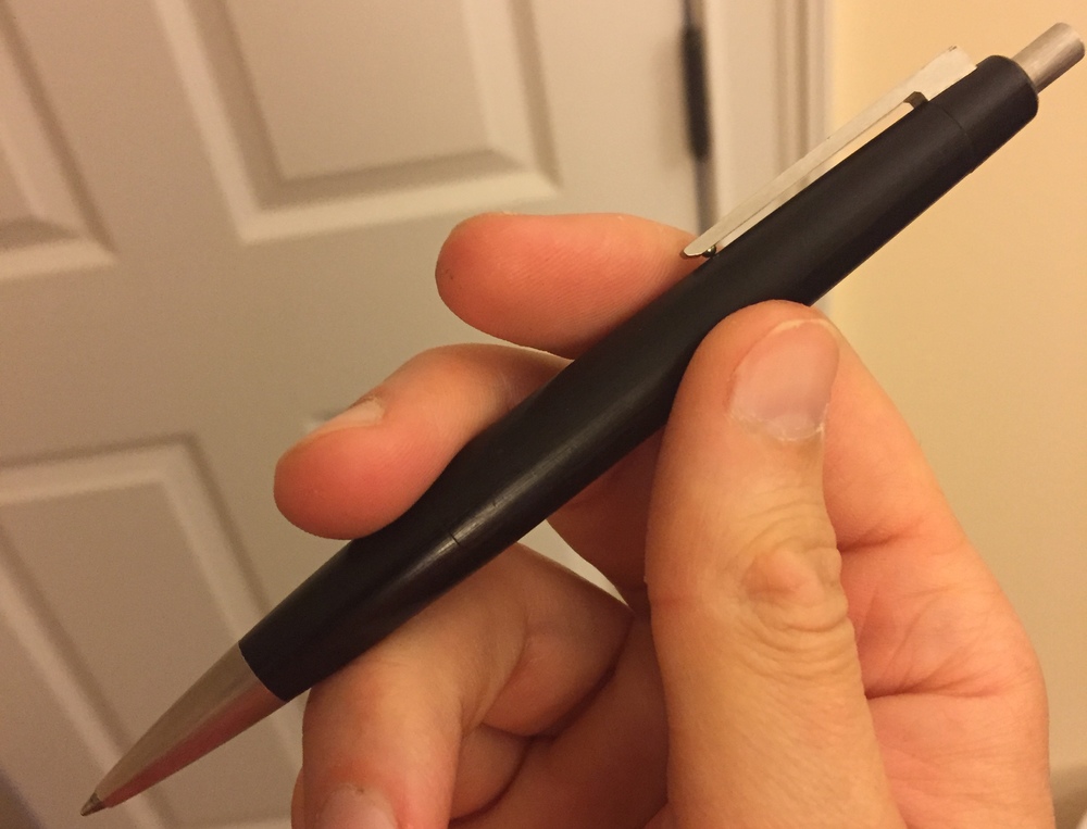
Vintage Lamy 2000 Ballpoint (with modern Lamy refill).  the Makrolon is worn smooth, and has a nice patina. 

Vintage Lamy 2000 Ballpoint (with modern Lamy refill).  the Makrolon is worn smooth, and has a nice patina. 

Legible barrel imprint reads "Lamy 2000 W. Germany."  The oldest the pen could be is early 1990s.  

Legible barrel imprint reads "Lamy 2000 W. Germany."  The oldest the pen could be is early 1990s.  

The real fun started around 4, when several attendees organized a pen and ink swap/testing table out in the hotel bar that was heavily attended.  I wish I could give you a blow-by-blow, but to be honest I tried out so many different pens and inks, from so many different people, over the course of five or six hours that they all started to run together.  All agree, however, that the main highlight was Leigh Reyes and her traveling set of Nakayas, which included both selections from the standard line of pens as well as some rare editions and prototypes that you probably would not be able to see anywhere else in the world.  Thomas Hall also brought two large cases full of pens, many of which had custom nibs.  

Pen Swap Atlanta 2015 Leigh's traveling Nakayas!  

Leigh's traveling Nakayas!  

Leigh's Nakaya Piccolo in Titanium.  

Leigh's Nakaya Piccolo in Titanium.  

I cannot emphasize enough how incredibly generous Leigh and Thomas both were in allowing all of us noobs (because we are all noobs in comparison to them) handle their priceless pens.  After mentally blowing my budget for the next two years, I “saved some money” by trading a few inks I wasn’t crazy about, and sold a few extra bottles of some inks that I had duplicates of.   

Ana over at the Well-Appointed Desk was there as well, and she has a great writeup containing even more pictures.  (For the full low-down, check out her flickr album!

From what I hear, show-'n-tell continued into the wee hours of Sunday morning, but unfortunately I had to be back home by noon the next day.  With a four hour drive staring me in the face, I chose to grab some sleep and leave everyone after an enjoyable dinner at the hotel that featured an all-star cast of Pendom.  I will be back next year, and I hear plans are in the works for a repeat. . . . clear your calendars and stay tuned.  As for other shows, Atlanta will probably be my last pen show until the 2015 D.C. SuperShow in August.  

A bit of additional information on the Lamy 2000 Ballpoint/Multipen discussed in this week’s PenAddict podcast.  Lamy still makes both pens, including the Multipen that takes D1 refills.  The ballpoint runs about $55-60, with the Multipen ticking slightly higher into the $60-65 range.  They are not incredibly easy to find, and Amazon indicates its stock is running low on the multipen.  (Both are Prime-eligible, so you will save some on shipping, and obtain near-instant gratification). (Affiliate Links).   


Where Do I Go From Here?

$
0
0

It’s a question I asked myself often over the past weekend at the Atlanta Pen Show.  One of the great things about pen shows is that you get the opportunity to see, hold, and learn about pens that you never otherwise would have experienced.  And since I spent two days surrounded by friends (both new and old) eager to let anyone write with the invaluable pieces in their collections, I experienced a lot of pens.  My takeaway from this?  I need to break the “pen of the month” habit and focus on acquiring fewer pieces that mean more to me.  

This topic came up in a few different conversations that I had over the weekend.  A general consensus seems to be that you reach a point in your “collecting” that you plateau, and begin to derive less enjoyment from the typical “production line” pens that are easily available.  While there are always exceptions to this rule, finding a unique or different writing experience out of the box becomes difficult, and you end up chasing color variants of the same pen or the full line of stock nib options.  Some time ago I reached the point where I don’t feel the need to have more than one TWSBI, especially where I can purchase a bunch of replacement nibs and obtain variety that way.

Leigh Reyes' Nakayas.  While Nakayas are not "custom" (several retailers carry them as part of their regular stock) some of the limited or rare variants are difficult to obtain and made to order, and certain models are exclusive to individual shops. 

Leigh Reyes' Nakayas.  While Nakayas are not "custom" (several retailers carry them as part of their regular stock) some of the limited or rare variants are difficult to obtain and made to order, and certain models are exclusive to individual shops. 

Enter the world of custom pens. 

I’m ready to move on.  But to where?  Of all the pens I was able to try this weekend, the custom pens were the ones that really stood out and spoke to me.  By "custom", I'm referring to pens that are generally made to order by a pen turner (typically by hand) according to the craftsman's original design, and can be adjusted to the user's preferences.  I was fortunate to handle a wide range of pens made by several makers, from Shawn Newton's Shinobi Eyedroppers to Brian Gray's Edison Menlos in Tibaldi Celluloid.  I wanted to keep all of them.       

So, I’ll ask myself again, where do I go from here?  It’s dangerous to put this sort of thing out there, but it’s pretty much the only way I’ll be able to hold myself accountable.  The next two pens I will acquire will come from custom manufacturers, once I can afford them, and until then I plan to thin out the accumulation of pens and ink to reduce the amount of "stuff" that I never use. 

If you’re interested in the world of custom pens, here’s some further reading to get you started.  My next pen will likely come from somewhere on this list:   

There are many, many more custom manufacturers out there.  Keep in mind that in order to enter the world of custom pens, you’ll have to suppress your desire for instant gratification (something that will be difficult for me).  Not only will you have to part with some money up front, but it generally takes at least 6 weeks for a pen to be made, and that's on the quick end of the spectrum.  In the end, however, I think the wait adds to the experience.   

Weekend Reading . . . UPDATE: All FPN Issues Resolved

$
0
0

It's taken me a while to get caught up on my reading after being away for a weekend.  So some of these may be a bit older than usual . . . but by no means stale!  

  1. Ray from FPQuest reviews two gorgeous Sheaffer Balance II's.  I've been looking for one of these for a while, but I haven't been able to grab one at a reasonable price (probably because of Ray's reviews)!  I'm still sold on the Aspen.  First review here; second review here
  2. Mary at From the Pen Cup reviews the Apex Pen (yet another Kickstarter pen that I missed).  Mary also shows off her new Cult Pens Mini Pen.   
  3. Gourmet Pens takes a look at the new Pelikan Edelstein Ink of the Year:  Amethyst.  
  4. MyCoffeePot reviews the Edison Beaumont Stealth.
  5. The ClickyPost reviews the Edelberg Sloop.  The review was so good I ordered a dozen or so to hand out to people at work.  Everyone could use a good ballpoint. 
  6. Mark from WriteAnalog reviews the Platinum Balance.  Another sub-$50 pen I have yet to try, and another great fountain pen review from Mark. 

And, of course, all the Atlanta Pen Show Recaps I can find are linked below.  If I'm missing one, let me know and I'll add it.  

And on a more serious (and extremely disappointing) note.  It's come to my attention, via The Pen Economist, that someone over at the Fountain Pen Network has been essentially republishing my blog and others on the site as an "RSS feed".  To both the FPN Admins and anyone else who is doing this elsewhere, this is not ok and amounts to stealing our content for your own profit.  (Of course, they are serving ads on their site.)  This is especially insulting when FPN's purported "rules and guidelines" prohibit bloggers from linking back to their own content in FPN discussion posts without purchasing a "premium membership":  

In a subject discussed on The Fountain Pen Network, links to other sites (including links to Blogs) may only be posted by approved and paying Premium Account Holders. Links, redirects or pointers to content, which duplicate content as found on The Fountain Pen Network, are not allowed. The Fountain Pen Network is a free service to our members, and The Fountain Pen Network maintains sets of rules, posting limitations, and a fee structure for those advertising goods, services, and external information sources such as blogs and sites which have similar content to the Fountain Pen Network.

In other words, they can steal and profit from our content, but we can't link back to our own websites from within FPN posts unless we pay them money.  It gets better:  

As a registered member of The Fountain Pen Network, you must observe all applicable federal, state and local law, including United States copyright, trademark, and obscenity law. In addition, you will not post any material which is defamatory, abusive, vulgar, hateful, racist, harassing, obscene, profane, sexually oriented, threatening, invasive of a person's privacy, which infringes intellectual property or other proprietary rights of any party, advocates any illegal or dangerous activity, or is otherwise in violation of any law, that contains any virus or other harmful component, and/or any material deemed offensive or inappropriate by FPN.

I'm revising my copyright notice on the blog and, more importantly, canceling my FPN account.  Just because I allow readers to download my content via RSS feed for their own personal use does not give anyone a right to effectively stream the content on their own site.  Enough of a rant.  I'll keep you all updated on how this shakes out.  

**FOLLOW UP**  To their great credit, the FPN admins have graciously apologized and removed all of the content in question from the site.  I still disagree with their policy of restricting bloggers' ability to post content and links unless they purchase a paying account.  Ultimately, such policies only serve to limit the amount of content available to FPN members.  But that's their prerogative, and I'm more than satisfied with their response to our concerns.  I consider this issue closed.   

Monday Bag Dump!

$
0
0
This week's carry, including some of my Atlanta Pen Show Haul!  Check out the Nock Co. Fodderstack XL with the new dot-dash pocket notebook (fountain pen-friendly version).  

This week's carry, including some of my Atlanta Pen Show Haul!  Check out the Nock Co. Fodderstack XL with the new dot-dash pocket notebook (fountain pen-friendly version).  

I spent some time yesterday afternoon pulling together my stationery carry for the week.  I'm traveling for at least two days (flying), so this is on the "light side."  Clockwise from bottom left:

  1. Nock Co. Lookout three pen holster with Franklin-Christoph Pocket 66 (Masuyama broad Cursive Italic, inked with Diamine Regency Blue); Sailor Pro Gear Imperial Black Edition (F nib, inked with Callifolio Bourgogne); Waterman Hemisphere (F nib, inked with Sailor Grenade).  I'm really liking the color combination on the Lookout (Mandarin/Blue Jay), which I won in the raffle at the Sassafras Spring Fling following Day One of the Atlanta Pen Show.  The Blue Jay really pops. 
  2. Nock Co. Black Dot-Dash 48-page pocket notebook, with Nock's new fountain pen friendly paper.  This paper absolutely kills it, especially where pocket notebooks are concerned.  Not only are feathering and bleed-through minimized (you should only have problems with extremely wet stubs or flex nibs), but the dry time on this paper is unreal.  I'm also finding that a top-bound, reporter-style notebook is very useful to me at work for to-do lists, daily capture, etc.  
  3. Midori Traveler's Notebook (large size).  I'm working very hard to incorporate this into my EDC, as I love the form factor, the materials, and the paper.  It's getting more use, especially when I'm on the road.  This notebook contains my long-term task lists, trip planning, plane tickets, etc.  I've also added some card slots to hold business cards, insurance cards, and anything else I hopefully won't need on the road but don't want to regret not having in case I do. 
  4. Levenger Circa Notebook.  This one's a bit of a throwback, as I purchased this many years ago and have gone through sporadic periods of heavy use, as well as other times when I'm not using this product at all.  After purchasing the Staples Arc paper punch (which at the time was much cheaper than the Circa punch and fully compatible with Levenger products), I've been using the Circa notebook to hold notes that I've taken on sheets from my Doane paper Writing Pad.  
  5. Doane Paper Writing Pad, which is one of my favorite papers for everyday use, because the grid+lines layout allows me to write large or very small, and the paper itself works well with pencils, gel pens, ballpoints, and even some fountain pens unless they are very wet writers. The Doane Writing Pad is only ruled on one side of the page, so bleed-through doesn't matter.
  6. Baron Fig Confidant.  My personal everyday journal.  I love this paper.  
  7. Nock Co. Fodderstack XL.  Another excellent Nock Co. product that I'm looking forward to taking with me on the road.  The case is a sheath that holds up to two pocket notebooks (or one pocket notebook, plus some index cards, a checkbook, etc.)  It also has a pen slot that holds one large or two smallish-size pens.  I currently have my Sailor Pro Gear Sky (F nib, inked with Bung Box Sapphire) and a Lamy 2000 ballpoint (blue fine refill) stuck in the front.  This color combination is the Steel/Mandarin.     
Nock shot! 

Nock shot! 

Another shot of the pens I'm carrying this week.  From left: (1) Franklin-Christoph Pocket 66; (2) Sailor Pro Gear Imperial Black; (3) Waterman Hemisphere; (4) Sailor Pro Gear Sky; and (5) Lamy 2000 Ballpoint.  

Another shot of the pens I'm carrying this week.  From left: (1) Franklin-Christoph Pocket 66; (2) Sailor Pro Gear Imperial Black; (3) Waterman Hemisphere; (4) Sailor Pro Gear Sky; and (5) Lamy 2000 Ballpoint.  

None of these links are affiliate links, and all of these products were purchased with my own funds (or won fair and square in the Sassafling Raffle).  

Spring Cleaning!

$
0
0

You may have noticed a pause in new review content (pens, ink, etc.) around here, and it's because I've been doing some Spring cleaning this week.  In short, I have too many pens and inks that I never use, and my general rule is if I don't use something for 6 months to a year, it needs to go to a new home with the proceeds put towards savings or investing in something that I will use.  Here's what I'm cleaning out this week: 

From Left:  Vintage Conklin Endura in Bronze & Black Marble, standard size.  Restored with new sac, good condition, spots of brassing on the clip ($215); Pilot Metropolitan in Black (Medium) ($8); Pilot Metropolitan in Silver (Fine) ($8); Noodler's Konrad in Methuselah's Pinecone Ebonite (Flex Nib) ($20); Karas Customs G2 Bolt ($35); Sheaffer Snorkel (14K Medium Admiral (non tubular) nib, restored) ($55); Vintage Viceroy Pen/Pencil Set (Fine Gold Plated Nib, Restored) ($10). 

From Left:  Vintage Conklin Endura in Bronze & Black Marble, standard size.  Restored with new sac, good condition, spots of brassing on the clip ($215); Pilot Metropolitan in Black (Medium) ($8); Pilot Metropolitan in Silver (Fine) ($8); Noodler's Konrad in Methuselah's Pinecone Ebonite (Flex Nib) ($20); Karas Customs G2 Bolt ($35); Sheaffer Snorkel (14K Medium Admiral (non tubular) nib, restored) ($55); Vintage Viceroy Pen/Pencil Set (Fine Gold Plated Nib, Restored) ($10). 

Domestic Shipping will be $5-10, depending on how many pens you order.  Prices are relatively firm but I will consider discounts if you take multiple pens off my hands. 

I also have some vintage Parker Quink Permanent Blue-Black (Art Deco bottle, full), and a smaller bottle of Carter's Midnight Blue that I will consider letting go for $12 per bottle.  

Contact me through the blog or tweet at me @vintagegntlmn if interested.  I'm also active in the PenAddict Slack room.  

Weekend Reading

$
0
0

Here's some interesting stuff that hit feedly (in the brief time I had to read when I wasn't cleaning and shipping pens): 

  1. Peaceable Writer discusses Fude Nibs.  
  2. Pete Denison on why people in this community are awesome.  
  3. Jenny over at The Finer Point reviews the Original Field Notes.  
  4. Susan Pigott, writing for The Pen Addict, reviews Akkerman Shocking Blue.  Yet another ink I don't need (but after reading Susan's excellent review, am probably going to buy). 
  5. Very interesting article from the New York Times on Kickstarter projects that fail.  (Found this via Pete Denison on Twitter)  Short version: if you're backing a project on Kickstarter that involves the manufacture of a machine/appliance/electronics, your risk of the project failing goes way up, especially if the people running the project have very limited experience in manufacturing (not to mention the industry in question).  And people need to remember, startups are risky and fail all the time.  It doesn't necessarily mean that backers have been "defrauded" or "cheated."  

More Atlanta Pen Show reviews are still trickling out: 

And, finally, thanks to everyone who "helped" with my Spring Cleaning!  Hopefully I've enabled many people in the process.  I still have a few pens looking for new homes, including a nice vintage Conklin Endura in Bronze Celluloid, a Noodler's Ebonite Konrad, and a few off-brand vintage pen sets.  I also have a limited edition Lamy Studio in Ruby Red that I'd be willing to part with for a decent price.  Let me know if you are interested, and feel free to make me an offer. 

Thanks for reading! 

Ink Mixing: Putting Unused Colors to Work

$
0
0

We’ve all done it: Gone and splurged on a bottle of ink (or five) from Goulet or Jetpens, only to get it home and think, “mehhh?” Often the color’s not necessarily bad, but it’s not not exactly what you were looking for, so the bottle of ink sits unused and neglected in a drawer somewhere. 

What to do? There’s always eBay, the FPN or FPGeeks classifieds section, or you could work out a trade in the Pen Addict Slack Channel (or at a pen show!), but what if there are no takers? Consider mixing the ink! With a touch of creativity, a syringe, a steady hand, and a slight tolerance for making a mess, you could have a completely new ink in minutes. 

Warning: while you are engaged in ink mixing, avoid carpets, pets with light-colored fur, and your non-pen obsessed significant other. With regard to the latter, it’s probably best that they don’t come home to find you hunched over the sink with a syringe in one hand and an “ink vial” in the other. Trust me. 

I recommend leaving your "kit" at home and not mixing inks at work.  Unless you are really tight with H.R. and have enough credibility to explain this one.  

I recommend leaving your "kit" at home and not mixing inks at work.  Unless you are really tight with H.R. and have enough credibility to explain this one.  

Full disclosure: I’m an ink mixing novice. I present to you the product of my first effort: a mix of 4 parts Sheaffer Skrip Red and one part Aurora Black. I like the result, though next time I might try to go with a bit less black. I was going for a deep maroon (sort of like Diamine Oxblood), but it ended up just a shade too dark. 

I was pleased enough with the result of this mixing effort to use the whole ink vial.  There were no adverse effects from mixing these two inks:  It dried quickly and didn't bleed.  

I was pleased enough with the result of this mixing effort to use the whole ink vial.  There were no adverse effects from mixing these two inks:  It dried quickly and didn't bleed.  

Tips for mixing ink: 

  • If possible, only mix inks of the same brand. You can break this rule, as I obviously have here, but it involves a certain degree of risk since different ink companies might use different dyes, etc., that could react adversely to one another.
  • If you must break this rule and mix between inks (hey, I didn’t have any black Skrip), stick to “basic” or “safe” inks. (i.e., mix Waterman and Skrip, Aurora and Skrip, etc.) Don’t mix “boutique” inks (such as Noodler’s, Organics, Private Reserve, or Levenger) with anything other than their own brands. Even then, only mix within their “families”. For example, don’t for the love of God mix any of the Noodler’s Baystate inks with anything other than another Baystate Ink. Nathan Tardiff himself has stated that you shouldn’t do this, because it will cause an adverse chemical reaction and clog pens. Also, mixing a Noodler’s bulletproof ink with another non-bulletproof ink may cause the resulting mixture to be “not-bulletproof”. 
  • Most importantly, go slowly, and mix in small batches. I like to mix using an ink syringe and a small ink sample vial. The vials are marked with measurements up to 5ml on the side (enough approximately 5 fills in a cartridge converter pen). The grading helps you to determine the appropriate proportions.  Once you find a mix/color that you like, then you can make a larger batch.   

All you really need to mix inks are a syringe or a pipette (I find the syringe to be easier and more precise), ink, and a container to hold the result of your experiment.  I repurposed an old ink sample vial during the "experimental" phase, but when I go to mix a big batch of my red-black I am probably going to use one of the smaller Nalgene containers for storage.  A lot of people also use the Nalgenes for travel when they don't want to carry a full bottle of ink with them.  A wide variety of sizes are available.   

Disclaimer:  Mix inks at your own risk!  Assume that the result of your concoctions might harm a pen, and test them in less valuable writers before inking up that prized vintage Vac.  

This Week's Links

$
0
0

That was a busy weekend, so I'm a day late, but here are this week's links: 

  1. An interesting piece over at Alt.Haven on travelling with fountain pens.  I travel with fountain pens fairly regularly, and don't have much of an issue except with vintage pens, so they generally stay home.  If I'm travelling with someone, and, for example, have to work on an airplane and want to avoid an ink "incident", I'll typically just stick to a gel/ballpoint and/or a pencil. 
  2. Susan Pigott for The Pen Addict reviewing the Franklin-Christoph Model 19 "1901" in Smoke and Cinnamaroon.  I'm really starting to come around on Franklin-Christoph pens.  I now have two of their pens that I'm enjoying as eyedroppers, both equipped with the Masuyama cursive italics. 
  3. The Well-Appointed Desk reviews the Callifolio Oliphants ink.  I'm really enjoying the Callifolio Ink I picked up from Vanness Pen Shop at the Atlanta Pen Show.  It truly does behave well on all papers I've tried it on, flows well, and dries quickly. 
  4. Pens!Paper!Pencils! reviews the Roterfaden Taschenbegleiter.  You can cram a lot of stuff into that notebook, so if you're looking to streamline a daily notebook carry into a single form factor, this seems like a great option.  
  5. GourmetPens reviews the new Pelikan Cafe Creme.  I had the opportunity to handle this pen in Atlanta, and while it's perhaps a touch too small for me, it's pretty.  
  6. Ray at FPQuest reviews the Namisu Nexus Minimal Fountain Pen.  So far I've heard better things about the titanium nib option, rather than the stainless steel.  I'm going to hold off on this one for now.

As for me, I'm off to NYC later this week.  I'll finally be able to do some pencil shopping in person

Thanks for reading! 


Pen Review: Sailor Pro Gear Sky

$
0
0
Pro Gear Sky Picture

Initially, my Atlanta Pen Show experience was tinged with disappointment because I didn’t have the chance to get this pen worked on by Mike Masuyama, who previously had tuned my Sailor Pro Gear Imperial Black Edition to perfection.  I had ordered this pen, the Sailor Pro Gear Sky Demonstrator, nearly three weeks prior to the show, but unfortunately (and due to no fault on the part of the good folks at PenChalet) the pen was backordered and didn’t reach me until after I returned.  On a side note, during a conversation at the Atlanta Pen Show, I learned that Sailor actually doesn’t keep large numbers of pens in stock, but rather makes small numbers to order.  So, if you order an in-demand, limited edition pen (like the Sky) or special order a hard-to-find nib, Sailor has to make an entirely new pen to fill your order.  Explains a lot, and actually is kinda cool.    

The two prize pieces in my collection.  I love my vintage Vacumatics, but these two regularly find their way into my daily carry

The two prize pieces in my collection.  I love my vintage Vacumatics, but these two regularly find their way into my daily carry

The delay was worth it.  The Pro Gear Sky is an exceptional pen.  The color is exactly what I was looking for, and Sailor once again lives up to its reputation for nibs that write impeccably out of the box.  Lately, there has been a lot of focus on Nakaya in the pen blogosphere as the Japanese company that makes “the pen" for a lot of people.  I must confess:  Nakaya’s offerings, while nice, do not speak to me in the same way as my Sailor pens, particularly the Pro Gear series.  There is something about the specific size, weight and balance of this pen, and the fact that it posts well, that fits my hand and style of writing perfectly.  

The Background

Sailor’s Pro Gear Sky series is offered in three sizes:  the Pro Gear Slim/Sapporo (the smallest); the Pro Gear standard (the pen featured in this review); and the Pro Gear King of Pen (the largest).  All feature rhodium plated trim, including a rhodium-plated 21k nib, which nicely complements the clear blue acrylic body of the pens.  The blue color is supposed to approximate the color of the summer sky.  (It also matches up quite nicely with Sailor’s “sky blue” inks, such as Bung Box Sapphire, which was the first ink I used.)  While this pen has been out since late 2014, it is a limited edition, so it won’t be around forever. 

The Build

Like all Sailor pens, the Pro Gear Sky is sturdy and well constructed.  Some clear plastic demonstrators feel, well, “plasticky”, and you often get the sense that they won’t survive a drop or hold up well over the long term.  I don’t get that feeling about the Pro Gear.  The acrylic feels substantial and the pen has some heft to it.  There are no scratches, dings, or chips in the acrylic that are visible to my naked eye.  The cap is snug and the clip fits well to my shirt pocket.  Part of me wishes that Sailor offered a “Realo” piston filler model in the Sky series, but that’s a small complaint.  The majority of Japanese pens feature a cartridge-converter filling system, and Sailor is no exception.

IMG_0565.JPG
IMG_0566.JPG
IMG_0567.JPG
IMG_0562.JPG

The Nib

Sailor pens are known for their understated, classic designs and their high quality nibs.  Every Sailor pen I have owned has written well out of the box, and this one is no exception.  I opted for the fine nib (designated as Hard Fine, or H-F, on the side of the nib).  As a Japanese fine nib, it approximates a Western extra-fine, so if you are looking for a pen that lays down more ink, start with the medium and go from there.  My pen is not at all scratchy, however, and is relatively wet for a fine/extra-fine.  I mentioned earlier that I originally intended to have this pen worked on by Mike Masuyama, and that hasn’t changed.  This pen is an excellent writer out of the box, but as many of you know, Mike worked for Sailor for many years, and is especially adept ay making Sailor nibs write perfectly.  My Pro Gear Imperial Black wrote well out of the box, but after Mike was through with it, the pen became my favorite piece in my collection, and I consider it my “desert island” pen.  This one will be no different. 

Sailor Pro Gear Sky Nib The size of Sailor nibs is etched onto the side.  This one is a "Hard Fine", designated "HF".  The "Soft Fine" has a bit more spring to it, but is not quite flexible.  

The size of Sailor nibs is etched onto the side.  This one is a "Hard Fine", designated "HF".  The "Soft Fine" has a bit more spring to it, but is not quite flexible.  

Overall Experience and Takeaways

The experience of writing with a pen you really, really enjoy can’t always easily be reduced to words and accurately expressed on a blog.  My Sailor pens provide enjoyment that I don’t get with other pens that I like and use regularly.  I always have one inked up; and for the most part, it’s a Pro Gear.  

One note on this pen:  it feels ever so slightly larger than my Pro Gear Imperial Black, and I suspect that it’s due to the material being used (thick acrylic).  The Imperial Black, while the same length, has an almost imperceptibly slimmer barrel than the Pro Gear Sky.  To me the Imperial Black feels more comfortable, but that’s possibly due to the heavy use the pen has seen and the fact that its adjusted to my hand.

I purchased this pen from PenChalet, our sponsor, who carries a wide array of Sailor pens in stock and can special order most models. Their prices are competitive, and there is always a discount code or coupon floating around. 

Quick Links for a Travel Weekend

$
0
0
CW Pencil Enterprise Storefront

Some links for the end of a great weekend.  I spent a couple days in New York and was able to visit CW Pencil Enterprise (the actual storefront!) on the Lower East Side.  I'll have a write-up on that visit, and more from Manhattan, later in the week. 

  1. Ed Jelley (my partner in crime on Saturday) recently reviewed a cool pencil sharpener with a name that I am unable to pronounce.  Apparently you can get a variety of points on your pencils using this sharpener.
  2. Bob at My Pen Needs Ink has a great piece on quality control (or the lack thereof) in higher-end pens, an issue that I would characterize as endemic.  IMHO, any pen that costs more than $50 should write out of the box without hard starting or skipping.  That's a decent amount of money, and when I regularly start hearing stories of pens that cost $400+ not writing at all,  I can't help but wonder whether the companies making these pens are thinking at all about the experience of the end user. 
  3. The Well-Appointed Desk reviews J. Herbin Bleu Ocean.  Herbin has "updated" the formula to add gold flakes to the ink, consistent with Herbin's Rouge Hematite (Red) and Stormy Grey (grey).  I've not tried the blue or the grey inks in this line, but I experienced terrible clogging, gunking, and smearing problems with Rouge Hematite a while back.  The reviews I've read of the new varieties don't make me incredibly anxious to try them. 
  4. I backed the Penxo Leadholder pencil on Kickstarter (black and gold models). I've never owned a leadholder, but always have been intrigued by them and figured this is a good way to start.  The Penxo has been awarded a 2015 Reddot design award.     

And in case you missed it earlier in the week, I reviewed the Sailor Pro Gear Sky, which is one of my new favorite fountain pens.  Please check it out if you haven't already.

Top Five Stationery Stores in New York City

$
0
0
Let's just say I had a productive trip this past weekend.  

Let's just say I had a productive trip this past weekend.  

In no particular order, here are my top five stationery stores in New York City, which you shouldn't miss the next time you visit.  

CW Pencil Enterprise is located on Forsyth Street on the Lower East Side.  

CW Pencil Enterprise is located on Forsyth Street on the Lower East Side.  

  1. C.W. Pencil Enterprise.  The newcomer to the New York stationery scene opened this spring, after previously operating online-only, and already has been written up in the New York Times and New York Magazine, among others.  The shop is tiny, in a good way, meaning that it is carefully curated and every product featured in the store was personally chose by the owner, Caroline Weaver.  I am primarily interested in writing with pencils, but there is much to interest the artist as well.  The selection of Caran d'Ache (high-end Swiss pencils) is second-to-none, including my personal favorite, the Caran d'Ache Swiss Wood.  The store also carries a wide variety of notebooks, sharpeners, and books about pencils.  I could spend hours here (which unfortunately was impossible this past weekend).
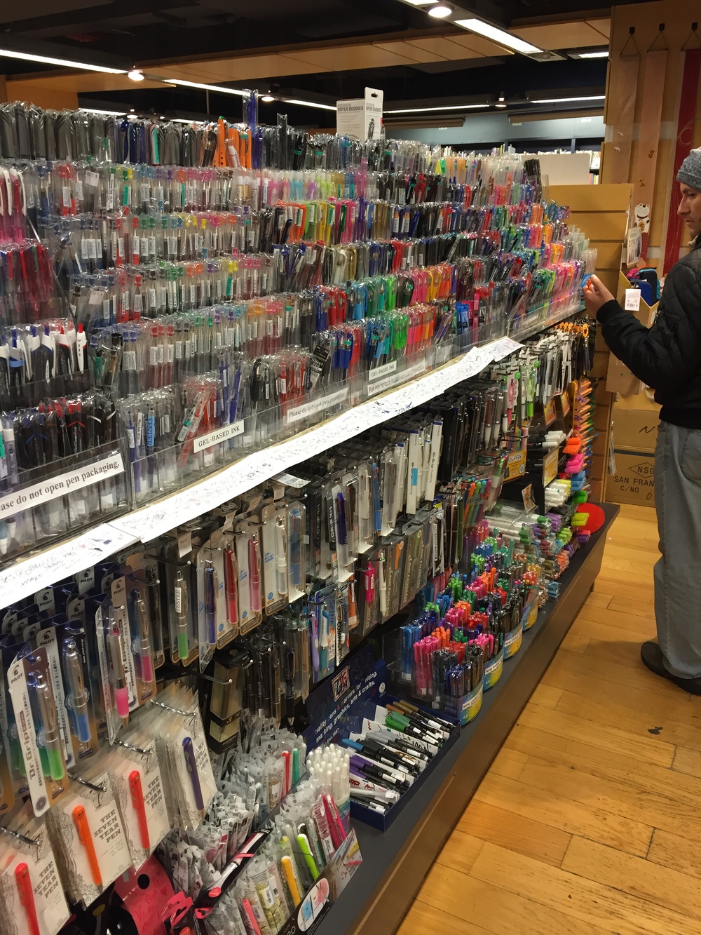
  2. Kinokuniya Bookstore.  A Japanese book and stationery retailer located on the western edge of Bryant Park.  While the majority of Kinokuniya is devoted to books and magazines (both English and Japanese), the store also has a phenomenal stationery department, including an entire wall of Japanese notebooks and paper, an aisle devoted to fine-tipped ballpoint, gel, fiber-tipped, and brush pens, mechanical and wooden pencils, erasers, and a few novelties.  Even if I don't buy much, or simply browse for an hour, I visit every time I am in town, without fail.  Since Art Brown Pen Shop closed down a couple years ago, Kinokuniya is also one of the few options for fountain pens in New York City.
  3. McNally Jackson.  A popular, if pricey, independent bookstore in SoHo which also has an office supply branch around the corner.  If you can afford them, the office supply store carries some beautiful items.  The bookstore has a "stationery nook" that stocks various high-end journals and pocket notebooks, including the limited edition Baron Fig Maker Edition, which I immediately grabbed.  In the past, I've had decent luck finding rarer "colors" editions of Field Notes stocked here, but couldn't find the elusive "yellow" version of the Field Notes Two Rivers Edition.  
  4. Blick Art Materials.  I always visit the Nolita and SoHo outposts of Blick when I'm in town.  They carry a great selection of pencils, colored pencils, pastels, paints, and other art supplies.  They also have a huge selection of sketchbooks and notebooks from Moleskine, Rhodia, Semicolon, etc.  Prices are competitive, and they will order anything for you if they don't have it in stock.  DaVinci Artist Supply is another great one, but I don't find myself there as often.   
  5. Fountain Pen Hospital.  When I am in the City during the week, I try to make the trek down to the Financial District to visit FPH.  The last dedicated fountain pen store in New York City, it has occupied the same space since 1946.  The store is fairly large, carries both modern and vintage pens, and offers pen restoration and repair services.  The selection of ink is also very good.  Closed on the weekends, which is a bummer.     
Last one at McNally Jackson! 

Last one at McNally Jackson! 

A shot of Kinokuniya's "Gel Pen Aisle".  Never seen anything like this in the states, have you? 

A shot of Kinokuniya's "Gel Pen Aisle".  Never seen anything like this in the states, have you? 

From the CW Pencil Enterprises vintage pencil vending machine.  I'm still not sure what exactly this refers to, but I assume (hope) it has something to do with horse racing. 

From the CW Pencil Enterprises vintage pencil vending machine.  I'm still not sure what exactly this refers to, but I assume (hope) it has something to do with horse racing. 

Amazon Alert: Midori Bullet Pencils and Pens

$
0
0

Before you miss it (because Amazon says stock is limited):  Midori Bullet Pencils and Pens are on sale for $15 (the pencil) and $17 (the ballpoint pen) with free Prime Shipping available on certain items.  This is a good deal, and cheaper than the current Massdrop option, which is $39.99 for both ($20 each once shipping is factored in), and that assumes enough people buy in to Massdrop to trigger the lowest cost.  I've pulled most of the available Midori "bullet" products into my affiliate store, although the two basic options are direct linked here (via affiliate links).  If you want to buy, please consider using these links and supporting the blog!  Thanks for reading.  

Franklin-Christoph: Eyedropper Mania!

$
0
0
Franklin-Christoph Eyedroppers in Case

As I recounted here, last month I decided to shift my modern collecting focus to custom pens, and sold off a large number items in my collection to fund several purchases that would give me a head start in this direction. I ordered four fountain pens: a Conid Bulkfiller Minimalistica, a Newton Shinobi, a Scriptorium Balladeer, and a Franklin-Christoph Model 65 Stabilis with a Masuyama-ground medium cursive italic nib. So far, the Model 65 is the only pen I’ve actually received, but--as you will soon be reading--I’m very pleased with the purchase.  This morning I received notice that the Conid has shipped (woo-hoo!), and the other two are in production and should make their way to me by mid-summer.  In the meantime, I wanted to give my first impressions of not only the Franklin-Christoph Model 65, but also the Franklin-Christoph Pocket 66 that I picked up at the Atlanta Pen Show last month.  

Past Experience

Franklin-Christoph is headquartered in North Carolina and has a long an interesting history. I have owned one Franklin-Christoph pen in the past: a Model 03 Iterum that I impulse purchased at the Baltimore pen show a few years back. The pen turned out to be something that just didn't work for me, though I liked the Masuyama-ground medium stub nib that came with it. Since then, I’ve watched Franklin-Christoph closely, waiting for another opportunity to pick up a different pen that spoke to me more. 

Model 66 Pocket and Model 65 Stabilis

The “Stabilis” line of pens originated as tester pens that F-C would bring to pen shows so that customers could test all of their various nib offerings. The Model 66 holds No. 6 nibs, while the Model 65 holds the slightly smaller No. 5. If you visit the F-C table at a show, they will have dozens of Stabilis pens set out on the table featuring the entire range of nibs in both High-Performance Steel and 18k Gold.  Their range includes standard nib sizes (EF, F, M, B, 1.1, 1.5), the Masuyama specialty nibs (XXF Needlepoint, Medium Italic, Broad Italic, Medium Stub, Broad Stub), and the 1.9mm Christoph Music Nib. It turns out that customers really liked the tester pens and wanted to buy them, so F-C began offering them for sale. 

Franklin-Christoph Nib Size Comparison:  Model 66 No. 6 nib on the left; Model 65 No. 5 nib on the right.  Note the threads at the top of the grip section.  

Franklin-Christoph Nib Size Comparison:  Model 66 No. 6 nib on the left; Model 65 No. 5 nib on the right.  Note the threads at the top of the grip section.  

The full size Model 66 Stabilis is a bit large for me (which is why I ultimately opted for the Model 65), but F-C does offer the Model 66 in a shorter “Pocket” version.  Seeing this for the first time at the Atlanta Pen Show, I couldn’t resist picking one up. It’s the perfect size for a daily carry pen, and for over a month it’s been inked and riding with one of my Sailor Pro Gears in the front pocket of my Nock Co. Fodder stack.  For a size comparison of the Model 65 Stabilis and the Pocket 66, see the gallery at the bottom of this post.   

Build Quality

The build quality on F-C pens is outstanding.  I have neither experienced nor heard of widespread problems with cracks, excessive scratching, or other manufacturing flaws. The caps thread on and post easily, and the threads are cut fairly wide and short, so that cap removal doesn’t take long while still attaching securely.  As Susan Pigott points out in her excellent review of the Model 65 for the Pen Addict, the threads are placed at the front of the grip section, out of the way of your fingers, so both Stabilis pens are very comfortable to hold.  The pens post well (important for me), and the Model 65 has a flat side so that the pen doesn’t roll off my desk—crucial for a “desk pen”!  The Pocket 66 is completely round, but it's used for pocket carry so I haven't had an issue. 

The "Ice Effect" in an eyedroppered Model 65 Stabilis.  

The "Ice Effect" in an eyedroppered Model 65 Stabilis.  

Most F-C pens are turned from acrylic, though they have some metal options as well. Both of my pens reviewed here are from the “ice” series of demonstrators, meaning that they are turned from clear acrylic but the inside of the pen barrel is not polished in order to maintain the “rough” texture. This creates a smoky, or “ice-like", appearance. When the pen is used as an eyedropper, you can still see the ink slosh around in the barrel of the pen, but the ink also settles in the nooks and crannies of the acrylic and looks, well, like ice. 

Filling System

Both of my Franklin-Christoph pens set up as eyedroppers.  On the left is the Model 65 Stabilis filled with Waterman Blue-Black (a classic workhorse!); on the right is the Pocket Model 66 filled with vintage Montblanc Bordeaux.  

Both of my Franklin-Christoph pens set up as eyedroppers.  On the left is the Model 65 Stabilis filled with Waterman Blue-Black (a classic workhorse!); on the right is the Pocket Model 66 filled with vintage Montblanc Bordeaux.  

Most Franklin-Christoph pens are versatile. They can be set up to write as cartridge-converter models or as eyedroppers. Both of my pens have been converted to eyedroppers. “Eyedroppering” a pen is not as scary as it sounds. You apply a small bit of silicone grease to the threads in two places: where the nib unit screws into the section, and where the section screws into the barrel. The trick is to make sure the silicone grease is applied all the way around the threads to seal the ink in the pen. I’ve had no accidents so far, and I’ve not been especially gentle with my Model 66 Pocket. 

Eyedropper:  the end result. 

Eyedropper:  the end result. 

A couple notes on eyedroppering: make sure you like the ink you use, because it will be with you for a while, and make sure the ink is relatively easy to clean, especially with the F-C “ice” models. As I noted above, the inside of the ice demonstrators is not smooth. I imagine that a staining ink could get trapped in the nooks and crannies and be difficult to clean. So far, I’ve stuck with Waterman, Montblanc, and Diamine inks and haven’t had any issues with flushing ink out of these pens when cleaning and refilling.  I've even changed inks once in the Pocket 66 (from blue to red), and I saw no residue from the old ink (Diamine Regency Blue) after about 10 minutes of cleaning.   

Nibs and Packaging

In my mind, two things make Franklin-Christoph pens truly stand out from offerings by other companies: the nibs and the packaging. First, the nibs. F-C uses JoWo nibs, the same nibs used by the Edison Pen Company, Newton Pens, Scriptorium Pens, and many more. While I have tried the 18K gold nibs at pens shows and found them to be smooth and a bit “springy,” JoWo’s "high-performance" (??) steel nibs are quality and I don’t notice a marked difference in performance that would justify the increased price (for me at least). As I mentioned above, one of the most attractive selling points of F-C pens is that they offer specialty nibs custom ground by Mike Masuyama. Some of these nibs are not regularly offered elsewhere, such as the XXF needlepoint, medium stub, and medium cursive italic options. You can also order extra nib units for your pens, and they are easy to unscrew and swap out. 

Writing Sample for the Model 65 (Masuyama Medium Cursive Italic) in Waterman Blue-Black. 

Writing Sample for the Model 65 (Masuyama Medium Cursive Italic) in Waterman Blue-Black. 

Writing sample for the Model 66 Pocket (Masuyama Broad Italic) in vintage Montblanc Bordeaux. 

Writing sample for the Model 66 Pocket (Masuyama Broad Italic) in vintage Montblanc Bordeaux. 

At the Atlanta Pen Show, I purchased the “Pocket 66” in clear ice, with the Masuyama broad cursive italic nib. I wanted the medium cursive italic nib, but they had sold out of the No. 6 nib in that size. So why not step out of my comfort zone? End result: there is not a significant difference between the two nibs. When I ordered my Model 65 Stabilis the following month, I opted for the medium CI, and while I slightly prefer the narrower size, it doesn’t keep me from using the Pocket 66 on a daily basis. Even the broad nib is still “fine” enough for me to use to annotate legal briefs and other documents, and it helps that the cursive italic grind, due to its sharpness, tends to not be as wet as a stub and therefore writes better on cheaper paper. 

New Franklin-Christoph packaging.  I love the useful leather pen case/carryall.  (I now have two of them.)

New Franklin-Christoph packaging.  I love the useful leather pen case/carryall.  (I now have two of them.)

Previously, F-C packaged it’s pens in the same faux-alligator clamshell box used by other pen companies such as Edison. While they make for great gift presentation, these boxes are of limited utility elsewhere. Franklin Christoph recently switched to packaging their pens in a brown leather zippered pen sleeve, which I find much more useful. The case easily holds one large pen or two small-to-medium pens, and I’ve also used it to carry a variety of pen-related items, from cartridges to gel pens. I have my Nock Co. gear to cart my fountain pens around, so it probably won’t get much use as an actual pen case. 

Takeaway

Franklin Christoph offers high-quality, versatile pens at a reasonable cost, especially if you are looking to try out custom nibs. If you don’t want to risk sending a pen you already own to a nibmeister to grind, I would highly recommend purchasing a Franklin-Christoph pen in a standard nib size (F,M,B) and then springing for an extra Masuyama nib unit. You are guaranteed to get a high quality grind, and Jim Rouse of Franklin-Christoph does one final tuning of the nib to make sure it writes correctly. At a pen show, he will let you write with the pen before he tunes it, and will adjust smoothness, ink flow, etc. to your preferences.  The end result is outstanding:  these two pens are among the best writing stub/italic nibs that I own, and I don't say that lightly.  

DISCLAIMER:  I have not been compensated, monetarily or otherwise, for this review.  Both of these pens were purchased by me with my own funds for my own use and enjoyment.  

IMG_1250.jpg
IMG_1251.jpg
IMG_1254.jpg
IMG_1255.jpg
IMG_1256.jpg
IMG_1257.jpg
Viewing all 1924 articles
Browse latest View live